Most of the time, yes. In this post, I’ll explain why there is usually a better chart to choose from than a pie chart and visualization techniques for categorical data.
This post was inspired by a book I read by Cole Nussbaumer Knaflic Storytelling with Data. I highly recommend it if your job has anything to do with presenting data. In the book, she explains how pie charts should always be avoided. Let’s look at a few examples to see why.
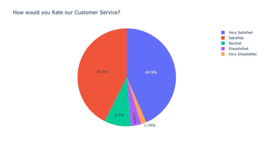
Comparing Pie Slices is Difficult
Take a look at this pie chart:

If it weren’t for the data labels, it would be a guess as if Very Satisfied or Satisfied was the top rating.
Since my slices aren’t directly labeled, the viewer has to constantly switch between looking at a slice and then looking at the legend. It’s a lot of mental effort to illustrate a simple breakdown of scores. Another thing to consider is that someone who is colorblind might have trouble matching up the legend to the slices.
Comparing Pie Slices Between Two Pies is even more Difficult
Consider this example with customer service ratings for 2018 and 2019.

The first pie chart was already hard to read and adding in a second one doesn’t make it any easier. Now the reader is forced to use even more mental energy trying to compare a slice across pie charts.
What is your Message?
Displaying a bunch of data just to display data doesn’t help anyone. Pie charts usually convey a breakdown without explaining what is important. Whenever you make a visualization, consider what question you are trying to answer. You should also consider what the reader should take away from looking at this chart.
Horizontal Bar Charts are Usually the Better Choice
Here is the first pie chart re-plotted as a horizontal bar chart:

Measuring the size of a bar is much easier. This chart is also sorted by the highest rating which allows the reader to get a list of the highest to lowest categories by scanning the y-axis.
Horizontal bar charts allow for more space for the categorical labels. This is helpful when there are a lot of categorical items. When using a vertical bar chart, the labels can get squeezed or are slanted which makes it hard to read.
When comparing the same categorical item over a different time period, for instance, a grouped bar chart allows for easy comparison as well.

The final piece of advice that really helps make this chart shine is to add messaging to it. What do you want your reader to take away from the chart? Do you want to highlight that most ratings are Satisfied or Very Satisfied? Or do you want to highlight the negative ratings? Here is how the chart can look when highlighting the positive ratings:

Light grey is a great color to keep data points in the background. Like, Cole Nussbaumer Knaflic, I am also a fan of using blue to highlight the data points I want the audience to pay attention to.
Interactivity Resolves a lot of Issues with Pie Charts
There is still a case for pie charts. I use Python for my data analysis and an interactive charting library called Plotly to power a lot of the visuals I produce.
Interactivity allows you to hide data lables and reveal them when the user hover overs the slice. This means that your chart doesn’t have to be cluttered with data labels.
Pie charts are also fine to use if you are simply trying to understand the breakdown of a category and the relative size doesn’t really matter. It’s important to sort the pie slices by largest to smallest so that my eye can go counter-clockwise to read the categories.
Lastly, if you have hundreds of categories, a horizontal bar chart can get really long. Pie charts don’t get taller with more categories. Depending on your messaging, the audience might not need to know the labels beyond the top five or ten categories.
The following is a breakdown of where Netflix shows and movies are produced. It’s using a public data set on Kaggle. You can view my notebook here with the full analysis.
To summarize why I prefer to use Plotly for this visual:
- Interactivity – because the chart is interactive, data labels don’t have to be displayed which typically clutters up the entire chart. Instead, if you want to see more, you can hover over and reveal the data
- Autoscaled data labels – The chart is kept clean by auto-scaling the data labels which highlights the slices that take up the most space. It also avoids having labels all around the charts with confusing lines to the pie slices
What about Treemaps Charts?
Treemaps are another interesting visual to use to display categorical data. Instead of pie slices, the chart uses boxes to visualize the frequency of the category item. I haven’t used them personally in my work because I think they are a very similar visualization to a pie chart. The treemap chart works pretty well when the audience can interact and drill down. In the chart below, you can click on any box to perform a drill down.
Final Thoughts
Why do people use pie charts in the first place? One thought is that they can be a cool-looking visual on a dashboard. Having a ton of horizontal bar charts doesn’t look as impressive to a dashboard with every different type of visualization one can find. Another thought is that I can say that I overused pie charts in all my school projects as it’s the go-to chart for categorical data.
I hope I was able to convince you that horizontal bar charts should be your new go-to categorical charts.
Thanks for reading!