In this post, I’ll take a look at the data from Our World in Data to visualize data from the COVID-19 vaccine rollout.
Our World in Data publishes a daily CSV with a ton of COVID-19 metrics. Their datasets are pretty clean and they have great visualizations on their site to serve as a blueprint for working with their data. I’ll be using Plotly Express to re-create the visuals.
Let’s import the data to get started.
country_data_df = pd.read_csv('https://covid.ourworldindata.org/data/owid-covid-data.csv',parse_dates=['date'])
country_data_df.head()
Here is a quick preview of the data:

One cleanup step is to fill in the gaps. Some countries have missing datapoints on specific days. However, it’s not as straightforward as using the pandas ffill function because there are some countries that don’t have any data in certain columns. By using the ffill function on the data, you’ll end up with data points spilling over into other countries. To address that, we can group each individual country and then apply ffill.
clean_up_cols = ['new_cases_per_million','total_vaccinations_per_hundred','new_vaccinations_smoothed_per_million']
for i in clean_up_cols:
  country_data_df[i] = country_data_df.groupby('iso_code')[i].transform(lambda x: x.ffill())
COVID-19 Cases by Country
Let’s start by looking at the number of COVID-19 Cases per country per million people.
df = country_data_df[country_data_df['date'] == country_data_df['date'].max()]

fig = go.Figure(data=go.Choropleth(
    locations=df['iso_code'],
    z=df['new_cases_per_million'].astype(float),
    colorscale = 'Sunsetdark',
    marker_line_color='white',
    colorbar_title="Cases per Million People"
))

fig.update_layout(
    title_text='Cases per Million People - '+dt.datetime.strftime(country_data_df['date'].max(),'%b %-d, %Y'),
    geo = dict(
        #scope='usa',
        projection_type='equirectangular'
        ), height=500, margin=dict(l=50, r=50)
)

fig.show()
Vaccine Data by Country
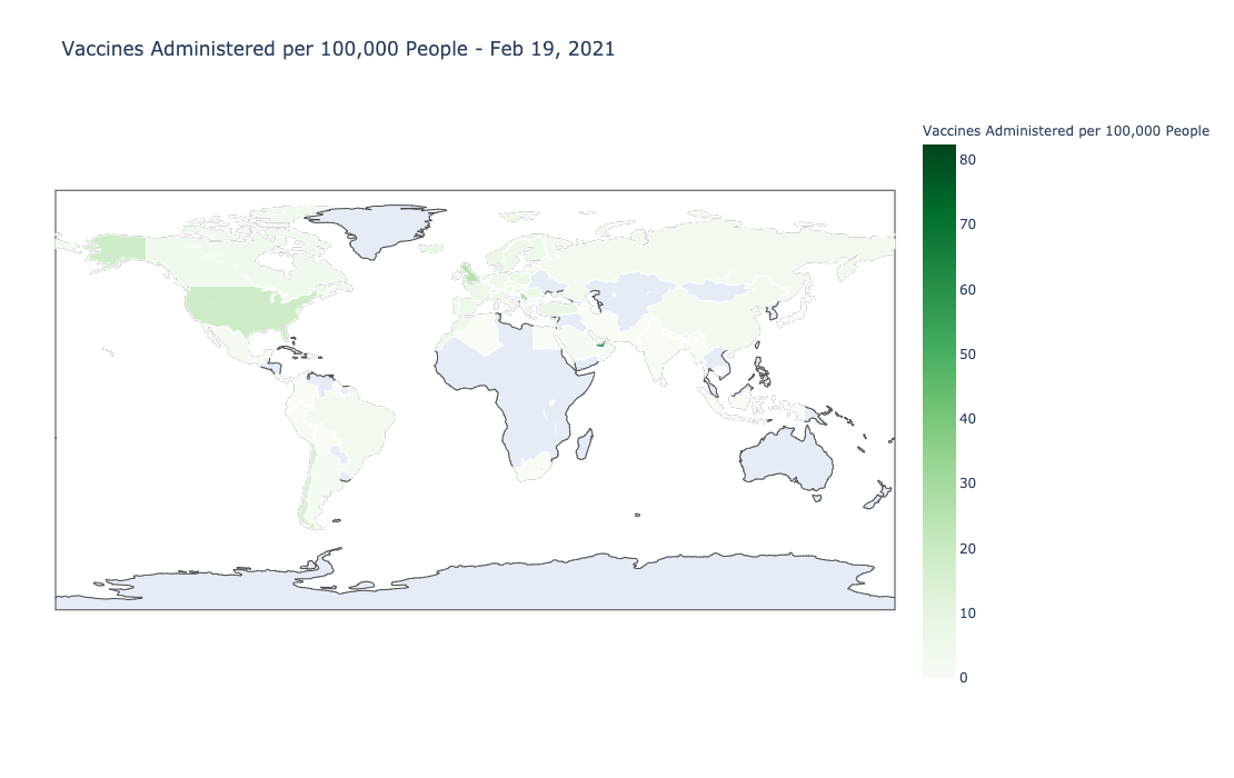
Now we can look at the vaccine rollout by country. I’ll use the total_vaccinations_per_hundred column to see which country has administered the most vaccines normalized by population.
df = country_data_df[country_data_df['date'] == country_data_df['date'].max()]

fig = go.Figure(data=go.Choropleth(
    locations=df['iso_code'],
    z=df['total_vaccinations_per_hundred'].astype(float),
    colorscale = 'Greens',
    marker_line_color='white', # line markers between states
    colorbar_title="Vaccines Administered per 100,000 People"
))

fig.update_layout(
    title_text='Vaccines per 100,000 People - '+dt.datetime.strftime(df['date'].max(),'%b %-d, %Y'),
    geo = dict(
        #scope='usa',
        projection_type='equirectangular'
        ), height=700, margin=dict(l=50, r=50)
)

fig.show()
Now let’s isolate the top 20 countries with the highest amount of doses administered per hundred thousand people.
#Return the most recent data set
filt = (country_data_df['date'] == country_data_df['date'].max()) & (country_data_df['location'] != 'World')

#Isolate the top 20 countries
top_twenty_vaccinated = country_data_df.loc[filt].sort_values(by='total_vaccinations_per_hundred', ascending=False).head(20)

filt = (country_data_df['location'].isin(top_twenty_vaccinated['location'].unique().tolist())) & (country_data_df['date'] >= dt.datetime(2020,12,1))
Now we can plot the data.
fig = go.Figure()

lst = top_twenty_vaccinated['location'].unique().tolist()

for i in lst:
  filt = (country_data_df['location'] == i) & (country_data_df['date'] >= dt.datetime(2021,1,1))
  df = country_data_df.loc[filt]
  fig.add_trace(go.Scatter(x=df['date'], y=df['total_vaccinations_per_hundred'],opacity=.75 ,mode='lines+markers',name=i))

fig.update_layout(template='simple_white', hovermode='x', title='Total Vaccinations per 100,000 people')
fig.update_yaxes(type="linear")
fig.show()
We can switch the axis to a log scale to get a better look at the other countries. To do that, you can add change line 11 to log: fig.update_yaxes(type="log").
To look at new vaccines per million people, we can use the column new_vaccinations_smoothed_per_million
fig = go.Figure()

lst = top_ten_vaccinated['location'].unique().tolist()

for i in lst:
  filt = (country_data_df['location'] == i) & (country_data_df['date'] >= dt.datetime(2021,1,1))
  df = country_data_df.loc[filt]
  fig.add_trace(go.Scatter(x=df['date'], y=df['new_vaccinations_smoothed_per_million'], opacity=.75 ,mode='lines+markers',name=i))

fig.update_layout(template='simple_white', hovermode='x', title = 'New Vaccinations per Million People (smooth)')
fig.update_yaxes(type="linear")
fig.show()
US State Vaccine Rollout
The data for US states are in a different CSV file.
state_vaccines = pd.read_csv('https://raw.githubusercontent.com/owid/covid-19-data/master/public/data/vaccinations/us_state_vaccinations.csv',parse_dates=['date'])
state_vaccines.head()
I will apply the same data cleanup as before:
clean_up_cols = ['daily_vaccinations','total_vaccinations_per_hundred','total_vaccinations_per_hundred','people_vaccinated']
for i in clean_up_cols:
  state_vaccines[i] = state_vaccines.groupby('location')[i].transform(lambda x: x.ffill())
Let’s chart the top ten to see which states have administered the most vaccines:
filt = (state_vaccines['date'] == state_vaccines['date'].max()) & (state_vaccines['people_vaccinated'] > 50000) & ~(state_vaccines['location'].isin(['United States']) )
states_sorted_total = state_vaccines.loc[filt].sort_values(by='daily_vaccinations', ascending=False)['location'].tolist()

fig = go.Figure()

lst = states_sorted_total[:10]
df = state_vaccines

for i in lst:
  filt = (df['location'] == i) & (df['date'] >= dt.datetime(2021,1,1))
  temp_df = df.loc[filt]
  fig.add_trace(go.Scatter(x=temp_df['date'], y=temp_df['daily_vaccinations'], opacity=.75 ,mode='lines+markers',name=i))

fig.update_layout(template='simple_white', hovermode='x', title = 'US Daily Doses Administered by US State')
fig.update_yaxes(type="linear")
fig.show()
To look at total doses normalized by population, we can use the column total_vaccinations_per_hundred
filt = (state_vaccines['date'] == state_vaccines['date'].max()) & (state_vaccines['people_vaccinated'] > 50000) & ~(state_vaccines['location'].isin(['United States','Veterans Health','Indian Health Svc']) )
states_sorted_per_thousand = state_vaccines.loc[filt].sort_values(by='total_vaccinations_per_hundred', ascending=False)['location'].tolist()

fig = go.Figure()

lst = states_sorted_per_thousand[:20]
df = state_vaccines

for i in lst:
  filt = (df['location'] == i) & (df['date'] >= dt.datetime(2021,1,1))
  temp_df = df.loc[filt]
  fig.add_trace(go.Scatter(x=temp_df['date'], y=temp_df['total_vaccinations_per_hundred'], opacity=.75 ,mode='lines+markers',name=i))

fig.update_layout(template='simple_white', hovermode='x', title = 'US Daily Doses Administered by US State (Top 20)')
fig.update_yaxes(type="linear")
fig.write_html("state_total_vaccines_per_hundred.html",full_html=False, include_plotlyjs='cdn')

fig.show()
To see what percent of the population is vaccinated (which I believe is that they received at least one dose), we can bring in population data. I used population data from Infoplease, turned the table into a DataFrame, and put in the variable state_populations. The easiest way to do that would be to highlight the table and then turn it into a DataFrame by using the pd.read_clipboard() function.
vaccines_population_df = pd.merge(state_vaccines, state_populations, how='inner', left_on='location', right_on='State')

latest_state_data_df = vaccines_population_df.loc[state_vaccines['date'] == state_vaccines['date'].max()]

latest_state_data_df['Percent of Population Vaccinated'] = latest_state_data_df['people_vaccinated'] / latest_state_data_df['July 2019 Estimate']

#Charting
df = latest_state_data_df.sort_values(by='Percent of Population Vaccinated')

fig = go.Figure(go.Scatter(
            x=df['Percent of Population Vaccinated'],
            y=df['location'],
             mode='markers',
            orientation='h'))

fig.update_layout(
    template='simple_white',
    xaxis={'side':'top', 'tickformat':'%'},
    height = 1000,
    title='Percent of Population Vaccinated by US State')

fig.write_html("state_percent_vaccinated.html",full_html=False, include_plotlyjs='cdn')
fig.show()
Final Thoughts
You can check out the Jupyter Notebook by clicking on the link or check out the data in my Dash app.
Thanks for reading!