The Net Promoter Score has become a popular way to analyze survey data. Instead of calculating a straight average for 0 through 10 scores, scores are bucketed into Detractors, Passives, and Promoters.
In this post, I’ll use the Net Promoter Score methodology and apply it to a dataset of raw scores using Python.
What is the Net Promoter Score?
If you’ve ever flown on an airplane, stayed at a hotel, or purchased something online, you’ve probably received a survey emailed to you after the experience. The survey has a number of questions where you would rate on a scale of 0 to 10. The most important question of the survey is something phrased about how likely you would be to recommend the product, service, or company to friends or family.

- Promoters – this group gave a 9 or a 10 rating and was very satisfied with the product, service, or company. They will likely speak about it proactively with friends and family.
- Passives – this group rated a 7 or an 8 and had an okay experience with the product, service, or company. They are only counted in the denominator of the equation.
- Detractors – this group rated a 6 or lower and had a bad experience. They will likely proactively speak poorly about the product, service, or company.
The Net Promoter Score methodology involves bucketing scores into three groups as illustrated above. After that, you subtract the Detractors from the Promoters and then divide by the All Survey Responses.
Here is the calculation:

The final result can mean that the NPS score can range anywhere from 100 to -100. Yes, scores can be so bad they go negative.
Overview of the Analysis
Here are the steps to calculating and plotting the NPS calculation I’ll follow in this post:
- Create Sample Data
- Melt the DataFrame
- Categorize each Score
- Calculate the Net Promoter Score
- Chart the Data
Create Sample Data
For this project, I am creating a random data set with numbers from 0 to 10. 9 and 10 are weighted more heavily than 7 and 8 scores, and 7 and 8 scores more heavily than 0 and 6 scores. I typically run across data sets that are skewed to higher numbers so that is why I am applying this weighting.
In addition to random scores, I am assigning a random country and traveler type (business or leisure) to make the data set more interesting. This way we can break out the data by country and traveler type in our chart and analyze some trends.
import pandas as pd
import numpy as np
import seaborn as sns
import matplotlib.pyplot as plt
import matplotlib.ticker as mtick

df1 = pd.DataFrame(np.random.randint(9,11,size=(1000, 1)), columns=['How likely are you to reccomend the product?']) #promoters
df2 = pd.DataFrame(np.random.randint(7,9,size=(400, 1)), columns=['How likely are you to reccomend the product?']) #passives
df3 = pd.DataFrame(np.random.randint(0,7,size=(100, 1)), columns=['How likely are you to reccomend the product?']) #detractors

df = pd.concat([df1,df2,df3], ignore_index=True)

df['Country Number'] = np.random.randint(1, 6, df.shape[0]) #assiging a random number to assign a country
df['Traveler Type Number'] = np.random.randint(1, 3, df.shape[0]) #assigning a random number to assign a traveler type

#Function to assign a country name
def country_name(x):
    if x['Country Number'] == 1:
        return 'United States'
    elif x['Country Number'] == 2:
        return 'Canada'
    elif x['Country Number'] == 3:
        return 'Mexico'
    elif x['Country Number'] == 4:
        return 'France'
    elif x['Country Number'] == 5:
        return 'Spain'
    else:
        pass

#Function to assign a traveler type
def traveler_type(x):
    if x['Traveler Type Number'] == 1:
        return 'Business'
    elif x['Traveler Type Number'] == 2:
        return 'Leisure'
    else:
        pass

#apply the function to the numbered columns
df['Country'] = df.apply(country_name, axis=1)
df['Traveler Type'] = df.apply(traveler_type, axis=1)

df[['How likely are you to reccomend the product?', 'Country', 'Traveler Type']] #view to remove the random number columns for country and traveler type
Here’s a quick preview of the data:

Melt the DataFrame
Melting the DataFrame turns the data into a long format. This makes it much easier for grouping the data.
It doesn’t really make a big difference for this sample data set and it’s more relevant if you have multiple survey questions.
melted_df = pd.melt(frame = df, id_vars = ['Country','Traveler Type'], value_vars = ['How likely are you to reccomend the product?'],value_name='Score', var_name = 'Question' )

melted_df = melted_df.dropna()

melted_df['Score'] = pd.to_numeric(melted_df['Score'])
melted_df

Categorize each Score
I am using a custom function to categorize each score.
def nps_bucket(x):
    if x > 8:
        bucket = 'promoter'
    elif x > 6:
        bucket = 'passive'
    elif x>= 0:
        bucket = 'detractor'
    else:
        bucket = 'no score'
    return bucket
melted_df['nps_bucket'] = melted_df['Score'].apply(nps_bucket) melted_df
Here is a preview of the DataFrame so far.

Calculate the Net Promoter Score
To calculate the actual NPS score, I am going to group my data frame by the Country and Traveler Type. At the same time, I am applying a lambda function that uses the equation above.
grouped_df = melted_df.groupby(['Country','Traveler Type','Question'])['nps_bucket'].apply(lambda x: (x.str.contains('promoter').sum() - x.str.contains('detractor').sum()) / (x.str.contains('promoter').sum() + x.str.contains('passive').sum() + x.str.contains('detractor').sum())).reset_index()

grouped_df_sorted = grouped_df.sort_values(by='nps_bucket', ascending=True)
Chart the Data
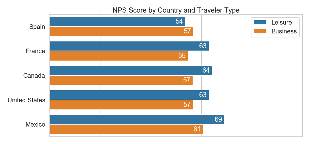
I am using seaborn to chart and style the data.
sns.set_style("whitegrid")
sns.set_context("poster", font_scale = 1)
f, ax = plt.subplots(figsize=(15,7))

sns.barplot(data = unpivoted_sorted,
            x = 'nps_bucket',
            y='Country',
            hue='Traveler Type',
               ax=ax)
ax.set(ylabel='',xlabel='', title = 'NPS Score by Country and Traveler Type')
ax.set_xlim(0,1)
ax.xaxis.set_major_formatter(plt.NullFormatter())
ax.legend()

#data labels
for p in ax.patches:
    ax.annotate("{:.0f}".format(p.get_width()*100),
                (p.get_width(), p.get_y()),
                va='center',
                xytext=(-35, -18), #offset points so that the are inside the chart
                textcoords='offset points',
                color = 'white')

plt.tight_layout()
plt.savefig('NPS by Country.png')
plt.show()
In my sample data set, it looks like Leisure guests rated higher in every country except for Spain.
And that’s it! Leave a comment below if you enjoyed this post or have a question!